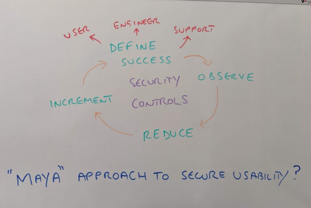
I want to talk about the age old trade off between the simplicity of a website or app, versus the level of friction, restriction and inhibition associated with applying security controls. There was always a tendency to split security at the other end of the cool and usable spectrum. If it was secure, it was ugly. If it was easy to use and cool, it was likely full of exploitable vulnerability. Is that still true?
In recent years, there have been significant attempts – certainly by vendors – but also by designers and architects, to meet somewhere in the middle – and deliver usable yet highly secure and robust systems. But how to do it? I want to try and capture some of those points here.
Most Advanced Yet Acceptable
I first want to introduce the concept of MAYA: Most Advanced Yet Acceptable. MAYA was a concept created by the famous industrial design genius, Raymond Loewy [1] in the 1950’s. The premise, was that to create successful innovative products, you had to reach a point of inflexion, between novelty and familiarity. If something was unusual in its nature or use, it would only appeal to a small audience. An element of familiarity had to anchor the viewer or user in order to allow incremental changes to take the product in new directions.
Observation
When it comes to designing – or redesigning a product or piece of software – it is often the case that observation is the best ingredient. Attempting to design in isolation can often lead to solutions looking for problems, or in the case of MAYA, something so novel that it is not fit for purpose. A key focus of Loewy’s modus operandi, was to observe users of the product he was aiming to improve. Be it a car, a locomotive engine or copying machine. He wanted to see how it was being broken. The good things, the bad, the obstacles, the areas which required no explanation and the areas not being used at all. The same applies when improving software flow.
Take the classic sign-up and sign-in flows seen on nearly every website and mobile application. To the end user, these flows are the application. If they fail, create unnecessary friction, or are difficult to understand, the end user will become so frustrated they are likely to attribute the entire experience to the service or product they are trying to access. And go to the nearest competitor.
In order to improve, there needs to be a mechanism to view, track and observe how the typical end user will use and interact with the flow. Capture clicks, drop outs, the time it takes to perform certain operations. All these steps, provide invaluable input in how to create a more optimal set of interactions. These observations of course, need comparing to a baseline or some sort of acceptable SLA.
Define Usable?
But why are we observing and how to define usable in the first place? Security can be a relatively simple metric. Define some controls. Compare process or software to said controls. Apply metrics. Rinse and repeat. Simple right? But how much usability is required? And where does that usability get counted?
Usable for the End User
The most obvious stand point is usability for the end user. If we continue the sign-up and sign-in flows, they would need to be simply labelled and responsive – altering their expression dynamically depending on the device type and maybe location the end user is accessing from.
End user choice is also critical, empowering the end user without overloading them with options and overly complex decisions. Assumptions are powerful, but only if enough information is available to the back-end system, that allows for the creation of a personalised experience.
Usable for the Engineer
But the end user is only one part of the end to end delivery cycle for a product. The engineering team needs usability too. Complexity in code design, is the enemy of security. Modularity, clean interfaces and nice levels of cohesion, allow for agile and rapid feature development, that reduces the impact on unrelated areas. Simplicity in code design, makes testing simpler and helps reduce attack vectors.
Usable for the Support Team
The other main area to think about, is that of the post sales teams. How do teams support, repair and patch existing systems that are in use? Does that process inhibit either the end user happiness or underlying security posture of the system? Does it allow for enhancements or just fixes?
Reduction
A classic theme of Loewy’s designs, if you look at them over time, is that of reduction. Reduction in components, features, lines and angles involved in the overall product. By reducing the number of fields, buttons, screens and steps, the end user user then has fewer decisions to make. Fewer decisions result in fewer mistakes. Fewer mistakes result in less friction. Less friction, seems a good design choice when it comes to usability.
Fewer components, should also reduce the attack surface and the support complexity.
Incremental Change
But change needs to be incremental. An end user does not like shocks. A premise of MAYA, is to think to the future, but observe and provide value today. Making radical changes will reduce usability as features and concepts will be too alien and too novel.
Develop constructs that benefit the end user immediately, instil familiarity, that allows trust in the incremental changes that will follow. All whist keeping those security controls in mind.
[1] – https://en.wikipedia.org/wiki/Raymond_Loewy
